In the fast-paced world of web development, the gap between design and implementation has long been a source of friction, inefficiency, and inconsistency. Designers meticulously craft user interfaces in tools like Figma, Sketch, or Penpot, only for developers to spend countless hours manually translating those static pixels into dynamic, functional code. This traditional handoff process is fraught with potential for misinterpretation and repetitive work. However, a new wave of automation is transforming this workflow. The rise of sophisticated design-to-code tools is creating a more seamless bridge, promising to convert intricate designs directly into clean, component-based frontend code for frameworks like Vue.js, React, and Angular.
This evolution is a significant part of the broader conversation in today’s frontend ecosystem, touching everything from Vue.js News to React News. These tools are not just simple HTML and CSS exporters; they aim to understand design system principles, componentization, and layout to generate code that serves as a powerful starting point for developers. This article provides a comprehensive technical deep-dive into how developers can leverage these modern design-to-code solutions within a Vue.js project. We will explore the core concepts, practical integration strategies, advanced techniques for building robust applications, and the best practices necessary to maximize efficiency while avoiding common pitfalls.
The Evolution from Manual Handoff to Automated Generation
For years, the process of turning a design into a web application was a labor-intensive, multi-step process. The advent of design-to-code automation represents a paradigm shift, fundamentally altering the collaboration between designers and developers and accelerating the entire development lifecycle.
The Traditional Bottleneck
Historically, the design handoff involved exporting assets, creating detailed specification documents (or “redlines”), and constant back-and-forth communication to clarify spacing, fonts, and behavior. Developers would then painstakingly recreate the UI from scratch, writing HTML markup and CSS styles to match the visual mockups. This manual translation was not only time-consuming but also prone to human error, leading to visual inconsistencies between the design and the final product. This inefficiency has been a long-standing challenge discussed across communities, from those following jQuery News in the past to modern framework discussions around Svelte News and SolidJS News.
The Promise of Design-to-Code
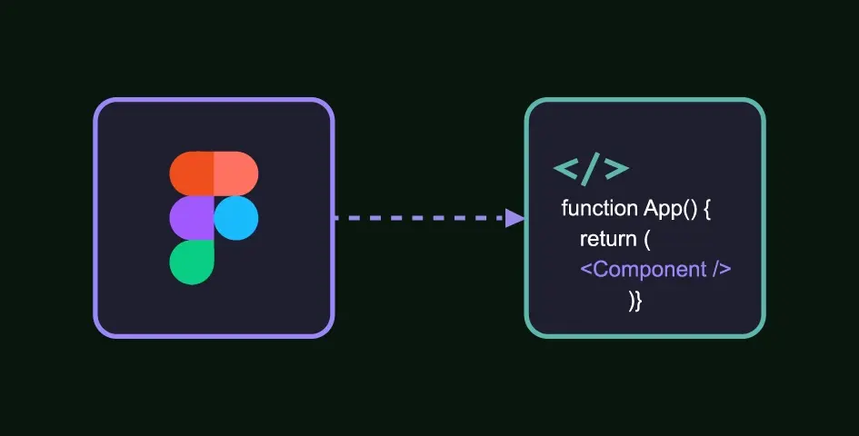
Modern design-to-code tools integrate directly with design files, analyzing layers, auto-layout settings, component variants, and styling information. They use this data to generate corresponding code. The key innovation is their ability to produce framework-specific components. Instead of just a block of HTML and CSS, they can generate a complete Vue Single File Component (SFC), complete with <template>, <script setup>, and <style scoped> blocks. This provides a structured, maintainable, and immediately usable asset for any Vue or Nuxt.js News follower, built on modern tooling like what you’d see in the latest Vite News.
A Baseline Vue 3 Component Structure
To understand the value of the generated code, it’s essential to know what a clean, modern Vue component looks like. The goal of a good design-to-code tool is to produce something close to this ideal structure. Here is a standard Vue 3 SFC for a simple user profile card, using the Composition API with <script setup>.
<!-- UserProfileCard.vue -->
<script setup>
import { ref } from 'vue';

const userName = ref('Alex Doe');
const userHandle = ref('@alexdoe');
const userBio = ref('Frontend Developer | Vue.js Enthusiast | Tech Blogger');
const isFollowing = ref(false);

function toggleFollow() {
  isFollowing.value = !isFollowing.value;
}
</script>

<template>
  <div class="profile-card">
    <img src="/path/to/avatar.png" alt="User Avatar" class="profile-avatar" />
    <div class="profile-info">
      <h2 class="user-name">{{ userName }}</h2>
      <p class="user-handle">{{ userHandle }}</p>
      <p class="user-bio">{{ userBio }}</p>
    </div>
    <button @click="toggleFollow" :class="['follow-button', { 'following': isFollowing }]">
      {{ isFollowing ? 'Following' : 'Follow' }}
    </button>
  </div>
</template>

<style scoped>
.profile-card {
  display: flex;
  align-items: center;
  gap: 16px;
  padding: 20px;
  border-radius: 12px;
  background-color: #f9f9f9;
  box-shadow: 0 4px 12px rgba(0, 0, 0, 0.08);
  max-width: 450px;
  font-family: sans-serif;
}
.profile-avatar {
  width: 80px;
  height: 80px;
  border-radius: 50%;
}
.user-name {
  margin: 0;
  font-size: 1.25rem;
  font-weight: 600;
}
.user-handle {
  margin: 4px 0;
  color: #555;
}
.user-bio {
  margin: 8px 0 0;
  color: #333;
  font-size: 0.9rem;
}
.follow-button {
  margin-left: auto;
  padding: 8px 16px;
  border: 1px solid #007bff;
  background-color: #007bff;
  color: white;
  border-radius: 20px;
  cursor: pointer;
  transition: all 0.2s ease-in-out;
}
.follow-button.following {
  background-color: #fff;
  color: #007bff;
}
</style>
From Generated Snippets to a Living Application
The output from a design-to-code tool is rarely a finished product. Instead, it’s a high-fidelity starting point. The real work begins when a developer takes this generated code and integrates it into a larger application, refactoring it for reusability, connecting it to a state management system, and ensuring it adheres to architectural best practices.
Initial Code Generation and Assessment
When you first generate a component, you might receive a file that perfectly matches the design visually but lacks dynamic capabilities. The HTML structure might be sound, and the CSS could be well-scoped, but the data is hardcoded. The developer’s first task is to assess this output and identify areas for improvement.
Here is a hypothetical “raw” output for our user profile card from a design-to-code tool:
<!-- GeneratedUserProfileCard.vue -->
<template>
  <div class="profile-card-1">
    <img src="/path/to/avatar.png" alt="image description" class="image-7" />
    <div class="flex-container-2">
      <h2 class="text-block-1">Alex Doe</h2>
      <p class="text-block-2">@alexdoe</p>
      <p class="text-block-3">Frontend Developer | Vue.js Enthusiast | Tech Blogger</p>
    </div>
    <button class="button-primary">
      Follow
    </button>
  </div>
</template>

<style scoped>
/* ...potentially non-semantic or overly specific generated CSS... */
.profile-card-1 {
  /* ...styles... */
}
.text-block-1 {
  /* ...styles... */
}
</style>
Notice the non-semantic class names and hardcoded text. The first step is to clean this up and prepare it for dynamic data.
Refactoring for Reusability with Props and Emits
To make the component useful, we must replace the hardcoded content with props and add event emitters for user interactions. This transforms the static component into a reusable building block that can display data for any user.
<!-- ReusableUserProfileCard.vue -->
<script setup>
defineProps({
  user: {
    type: Object,
    required: true,
    default: () => ({
      name: 'Default User',
      handle: '@default',
      bio: 'No bio available.',
      avatarUrl: '/path/to/default-avatar.png',
      isFollowing: false
    })
  }
});

const emit = defineEmits(['toggle-follow']);

function handleFollowClick() {
  emit('toggle-follow');
}
</script>

<template>
  <div class="profile-card">
    <img :src="user.avatarUrl" alt="User Avatar" class="profile-avatar" />
    <div class="profile-info">
      <h2 class="user-name">{{ user.name }}</h2>
      <p class="user-handle">{{ user.handle }}</p>
      <p class="user-bio">{{ user.bio }}</p>
    </div>
    <button @click="handleFollowClick" :class="['follow-button', { 'following': user.isFollowing }]">
      {{ user.isFollowing ? 'Following' : 'Follow' }}
    </button>
  </div>
</template>

<style scoped>
/* ...Same clean, semantic CSS as the first example... */
</style>
This refactored component is now truly reusable. It accepts a `user` object as a prop and emits a `toggle-follow` event when the button is clicked, delegating the state change logic to its parent component. This is a fundamental pattern in building scalable Vue applications.
Connecting to State with Pinia
In a real-world application, user data and follow status would likely be managed in a global state store. Pinia is the official, lightweight, and intuitive state management library for Vue. Here’s how you might create a Pinia store and connect our component to it.
// stores/userStore.js
import { defineStore } from 'pinia';
import { ref } from 'vue';

export const useUserStore = defineStore('user', () => {
  const currentUser = ref({
    id: 1,
    name: 'Alex Doe',
    handle: '@alexdoe',
    bio: 'Frontend Developer | Vue.js Enthusiast | Tech Blogger',
    avatarUrl: '/path/to/avatar.png',
    isFollowing: false
  });

  function toggleFollowStatus() {
    currentUser.value.isFollowing = !currentUser.value.isFollowing;
    // In a real app, you would also make an API call here.
    console.log(`User ${currentUser.value.id} follow status is now: ${currentUser.value.isFollowing}`);
  }

  return { currentUser, toggleFollowStatus };
});

// ParentComponent.vue - Using the store and the component
<script setup>
import ReusableUserProfileCard from './ReusableUserProfileCard.vue';
import { useUserStore } from '@/stores/userStore';

const userStore = useUserStore();
</script>

<template>
  <main>
    <ReusableUserProfileCard
      :user="userStore.currentUser"
      @toggle-follow="userStore.toggleFollowStatus"
    />
  </main>
</template>
By connecting the component to Pinia, we’ve elevated it from a simple UI element to a fully integrated part of our application’s state logic. This pattern is crucial for managing complexity as an application grows.

Beyond Static Components: Building Dynamic and Testable UIs
The journey doesn’t end with component refactoring. To build a production-grade application, developers must address responsiveness, documentation, and, most importantly, testing. This is where the broader ecosystem of tools around Vue, such as those covered in TypeScript News and ESLint News, becomes critical for ensuring code quality and maintainability.
Component Libraries and Design Systems
Design-to-code tools are exceptionally powerful for bootstrapping a component library. By generating the base components from a design system in Figma, you can quickly create a collection of UI elements. Tools like Storybook are invaluable here. Storybook allows you to develop and test UI components in an isolated environment, documenting their different states (or “stories”). This is essential for teams to build consistently and efficiently. Integrating a testing framework like Vitest or Jest, often discussed in Jest News, directly into your Storybook setup allows for robust visual and interaction testing.
Testing Generated and Refactored Components
Never trust generated code without verifying it. Writing tests is non-negotiable for ensuring that your components work as expected, especially after refactoring. Vitest News has been exciting for the Vue community, as its tight integration with Vite provides a lightning-fast and modern testing experience. Here’s a simple unit test for our `ReusableUserProfileCard` using Vitest and Vue Test Utils.
// ReusableUserProfileCard.spec.js
import { describe, it, expect, vi } from 'vitest';
import { mount } from '@vue/test-utils';
import ReusableUserProfileCard from './ReusableUserProfileCard.vue';

describe('ReusableUserProfileCard', () => {
  const mockUser = {
    name: 'Jane Smith',
    handle: '@janesmith',
    bio: 'Testing enthusiast',
    avatarUrl: '/path/to/jane.png',
    isFollowing: false,
  };

  it('renders user information correctly', () => {
    const wrapper = mount(ReusableUserProfileCard, {
      props: { user: mockUser },
    });

    expect(wrapper.find('.user-name').text()).toBe('Jane Smith');
    expect(wrapper.find('.user-handle').text()).toBe('@janesmith');
    expect(wrapper.find('.profile-avatar').attributes('src')).toBe('/path/to/jane.png');
  });

  it('displays "Follow" when user is not being followed', () => {
    const wrapper = mount(ReusableUserProfileCard, {
      props: { user: mockUser },
    });
    expect(wrapper.find('.follow-button').text()).toBe('Follow');
  });

  it('emits a "toggle-follow" event when the follow button is clicked', async () => {
    const wrapper = mount(ReusableUserProfileCard, {
      props: { user: mockUser },
    });

    await wrapper.find('.follow-button').trigger('click');

    expect(wrapper.emitted()).toHaveProperty('toggle-follow');
    expect(wrapper.emitted()['toggle-follow']).toHaveLength(1);
  });

  it('displays "Following" and has the correct class when isFollowing is true', () => {
    const userFollowing = { ...mockUser, isFollowing: true };
    const wrapper = mount(ReusableUserProfileCard, {
      props: { user: userFollowing },
    });

    expect(wrapper.find('.follow-button').text()).toBe('Following');
    expect(wrapper.find('.follow-button').classes()).toContain('following');
  });
});
This test suite verifies that the component renders props correctly and emits the expected event on interaction. For more complex user flows, end-to-end testing tools like those in the Cypress News or Playwright News circles are essential for simulating real user behavior across the entire application.
Maximizing Value and Avoiding Common Pitfalls
To truly benefit from design-to-code automation, teams must adopt a collaborative mindset and be aware of the potential downsides. These tools are accelerators, not magic wands, and require a strategic approach to be effective.
Best Practices for Collaboration
- Design with Components in Mind: The process starts with the designer. By using features like auto-layout, components, and variants in their design tool, they provide a structured blueprint that translates much more cleanly into code.
- Establish Naming Conventions: Consistent and logical naming of layers and components in the design file (e.g., `btn-primary`, `card-header`) often carries over to the generated code, making it more semantic and easier to understand.
- Adopt an Iterative Workflow: Use the generated code as the first draft. The developer’s role is to enhance, refactor, and integrate this code into the application’s architecture. Treat it as a collaborative tool that automates the most tedious parts of UI creation.
Common Pitfalls to Avoid
- Over-reliance and Blind Trust: Never assume the generated code is production-ready. It may lack performance optimizations, proper semantic HTML, or accessibility features. Always review and refine the output.
- Ignoring Accessibility (a11y): Automated tools often miss the nuances of accessibility. Developers must manually audit the generated code to ensure it includes proper ARIA roles, keyboard navigation, and screen reader support.
- Code and Style Bloat: Some tools can generate overly specific or redundant CSS. It’s crucial to refactor styles to align with your project’s CSS methodology, whether it’s BEM, scoped styles, or a utility-first framework like Tailwind CSS.
Conclusion
The emergence of advanced design-to-code tools marks a significant milestone in the evolution of frontend development. For the Vue.js community, these solutions offer a powerful way to accelerate development, reduce the friction between design and code, and allow developers to focus more on complex logic, state management, and application architecture. The latest Vue.js News is not just about the framework itself, but also about the ecosystem of tools that enhance developer productivity.
However, these tools are most effective when viewed as collaborators rather than replacements. The generated code is a starting point—a scaffold upon which skilled developers build robust, accessible, and maintainable applications. By embracing a workflow that involves careful refactoring, integration with state management like Pinia, and rigorous testing with frameworks like Vitest, teams can transform static designs into living Vue.js applications faster than ever before. The future of frontend development is one where automation handles the mundane, freeing human creativity to solve the truly challenging problems.